Data visualization is the process of presenting information in the form of a graph to make raw data more understandable. Good data representation, such as charts, graphs, and graphics, enables people to quickly grasp what the data implies. However, it may be difficult to transfer content in a manner that is both informative and engaging.
Designing the user interface (UI) and user experience (UX) is an important component of how people interact with data displays. A solid user experience guarantees that the data is easy to find and amusing, while a well-designed interface enables users to traverse the display with ease.
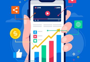
The Key Principles of Effective Data Visualization
User Friendly: The basic guideline of data representation is to keep things as simple as possible. Users should not be overwhelmed by the amount of information available. This entails keeping things simple and focused on what matters. Mind Treasury UI/UX Development prioritizes clear communication, so each component of the design has a function.
Choose the Right Visualization: Different visualization techniques work well with different kinds of data. Line graphs, for example, are excellent for demonstrating how things change over time, while pie charts may be used to portray portions of a larger picture. To communicate effectively, you must first comprehend the facts and then explain them as clearly as possible.
Consistent Design Language: Using the same colors, fonts, and symbols throughout your design creates a unified visual experience. Mind Treasury aims to increase user engagement by using a consistent design style. A coherent design not only seems professional, but it is also simpler for others to understand.
Interactivity: Allowing users to interact with one another may increase interest. Filters, tooltips, and drill-down options may help people better utilize data. Mind Treasury’s UI/UX Development strives to deliver engaging features that allow users to engage with data in real time.
Accessibility: Data visualizations should be developed such that they can be used by everyone. This includes choosing color schemes that are simpler for colorblind people to read, ensuring that the wording is intelligible, and providing visuals with distinct text. Mind Treasury promotes the need of adopting open design methodologies.
Data visualization tools and technologies
To create attractive data visualizations, you must use the right tools. Here are a few well-known alternatives that supplement the Mind Treasury approach:
- Tableau: Tableau is an excellent data visualization application that incorporates interactive capabilities. It is well-known for developing interactive maps.
- D3.js provides artists with a great deal of creative flexibility when it comes to developing dynamic, interactive visual content for anybody who wants to create their own web-based graphics.
- Microsoft Power BI is a popular corporate analytics application that allows users of all skill levels to see and report on data.
- Google Data Studio is a simple tool that enables people to work together to visualize data and create reports.
What role will data visualization play in the future of UI/UX design
As technology advances and data sets become more complex, there will be an increased need for enhanced data presentation. In the future, UI/UX for data presentation may include the following.
Artificial intelligence (AI) integration: AI may assist in identifying patterns and trends that may not be apparent from data alone. This knowledge allows for improved representation by providing individuals with personalized data.
Augmented reality (AR) and virtual reality (VR): These new technologies provide intriguing ways to look at data and make it seem genuine, allowing users to edit and examine data in three dimensions.
Real-time Data Processing: The ability to examine data as it arrives from various sources will push the boundaries of how data is now shown, necessitating new UI/UX designs.
Ethical Considerations: As individuals become more conscious of how we use and perceive data, ethical design principles will become more crucial in ensuring that visuals aid comprehension rather than providing incorrect information.